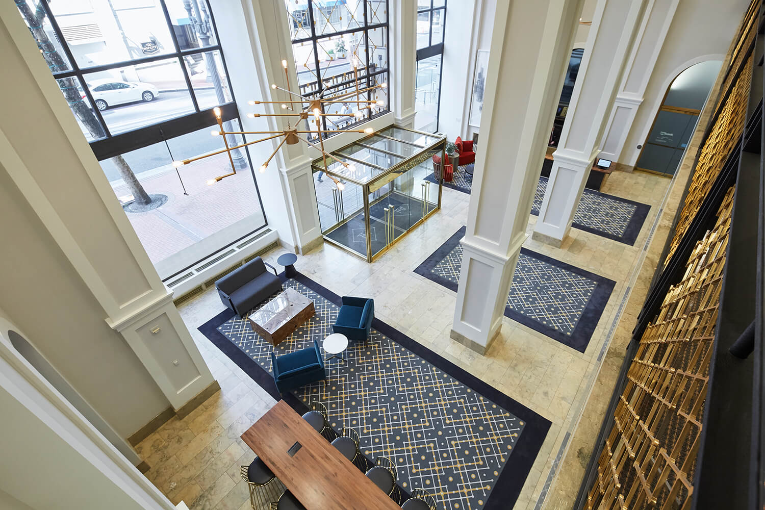
Beacon Capital Partners tasked ESI Design with rejuvenating the outdated Italianate-style property and restoring some of its historic character to help attract tenants.
The former Public Service Building was once the home of Portland’s main power station. ESI began by rebranding it as the Power+Light Building and designing an iconic building ID. The new logo, installed prominently above the main entrance, features a custom font taken from details original to the building and a +/- motif, inspired by electricity. New lighting in the archways gives the entry a jewel-box feel at night.
ESI carried the “power and light” theme into the interior with a design motif of connected electrical circuits that appears in the carpets, light fixtures and railings. Colorful furniture clusters, updated lighting, and warm natural surfaces in the workspace and security desk create a welcoming environment.
Wayfinding throughout the building utilizes the same graphic details, typography and materials to create a unified signage system. New lighting and graphics in the amenities areas (penthouse lounge, gym and bicycle parking) add to the overall cohesive experience of the building.
The result is a design that speaks simultaneously to the building’s past, present and future.
A large-scale renovation incorporates innovative additions that complement the building’s existing characteristics, resulting in an office destination for creative and traditional tenants alike.