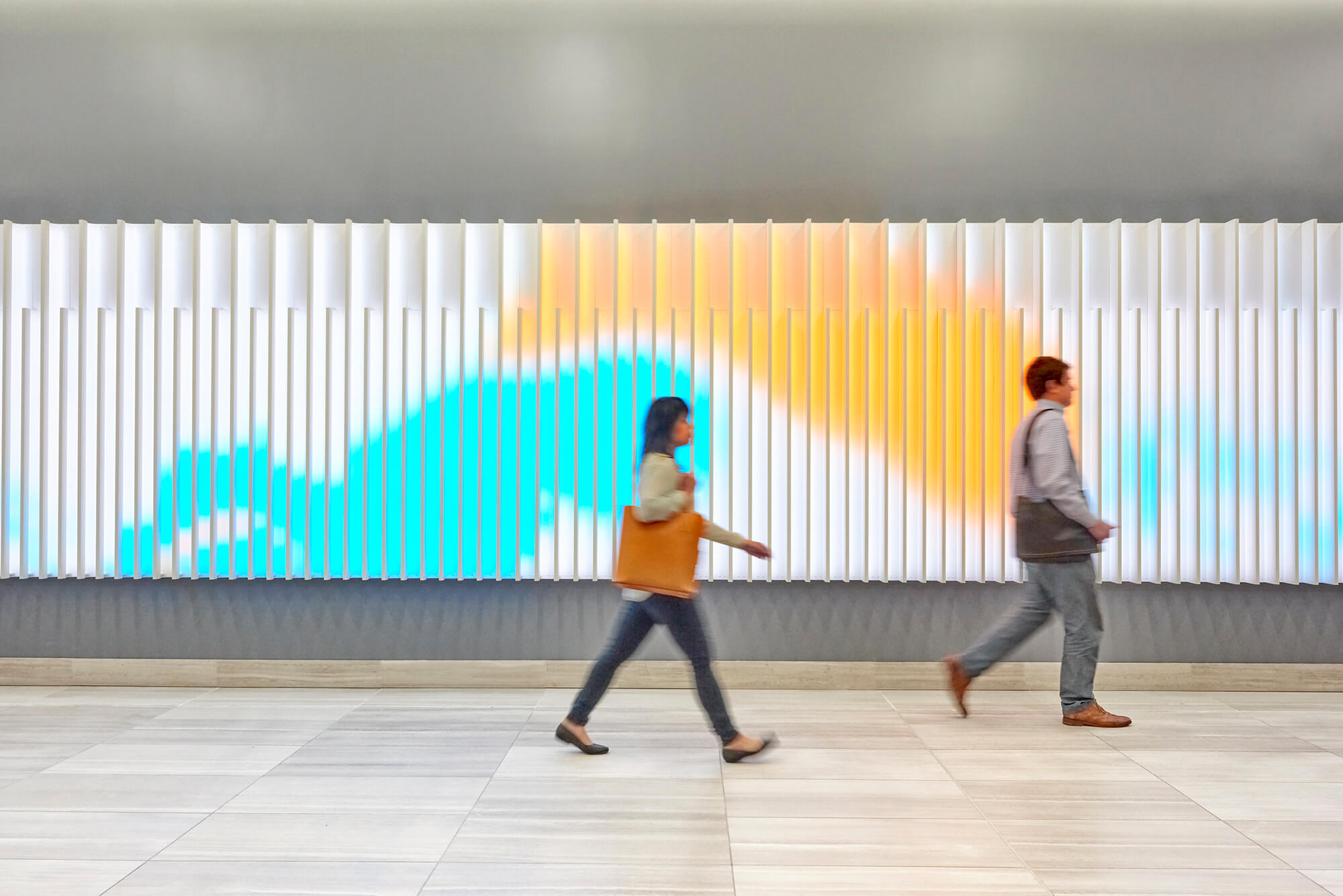
An iconic entrance and reactive digital art installation transform 44 Montgomery into a fitting home for start-ups and creatives.
Opportunity: Located at one of the busiest intersections in San Francisco’s Financial District, this 43-story tower needed a lobby as bright and dynamic as the tenants that pass through it.
Solution: ESI designed a media installation for the lobby that reacts to the movement of passersby, making the space feel spacious and alive. The media is driven by a suite of sensors that tracks visitors as they move through the lobby. As people walk to/from the elevator bays, they become digital paintbrushes, trailing a colored path across the display. As more and more people fill the lobby, the media fills with brushstrokes, becoming more colorful and dynamic.
The media supports two different “brush” types: a soft-edged, fluid Organic Brush and a hard-edged, tightly bound, Geometric Brush. The brush size grows as visitors get closer to the canvas, creating a mixture of heavy and light streaks as crowds move through the lobby. When two people cross paths, the colors mix and swirl around each other, creating new colors and unexpected patterns.
The media content plays on a custom, ribbed surface that echoes the fins on the tower’s facade, and emulates the movement of shadows and reflections cast by those fins through time-based programming.
Result: ESI’s design approach utilizes the horizontal orientation of the lobby and creates a bright, vibrant contrast to the largely monochrome space. The new design enhances the experience of existing tenants and will attract new business by reasserting 44 Montgomery’s identity as a San Francisco destination.
“The addition of architectural accents, a new entrance design, lighting, and signage are designed to unify the building’s exterior and increase its street presence.”