Public Spaces Amidst COVID-19: Short-term changes and long term opportunities for experience design
Posted August 31, 2020
ESI Design’s Senior Designer and A/V Technologist, Andrew Lazarow, recently wrote for AVIXA a piece discussing the obligations and opportunities for designing public spaces amid COVID-19:
“A man with a clear head looks at life directly, realizes that everything is problematic, and feels himself lost. And this is the simple truth, that to be alive is to feel oneself lost. And he who accepts this has already begun to find himself, to be on solid ground.” – Ortega y Gasset
As cities across America begin to re-open, we are starting to see various short-term solutions implemented to make public spaces safer. Plexiglass stands at cashiers’ stations and security desks. Printed environmental graphics on the floors. Within our industry, many of us have been asked about the safety of touch screens, and what we would replace them with in stores, museums, lobbies, and transit hubs. As our clients look to us to tell them what is coming next, it’s challenging to balance knowing what people will need years from now, when we don’t even know what schools will be doing in a month.
Uncertainty is a medium I am used to working with in my career. My background is theatrical design, where rewrites continued throughout production. A few years ago, I joined the team of multi-disciplinary experience designers at ESI Design, an NBBJ studio, where we begin every design decision by thinking about the audience. Who this is for? What experiences do they need or want in this space? What experiences do we want to give them? What is their surrounding context? Right now the context almost goes without saying. Circumstances, users’ needs, and morality all demand that we do our part to help mitigate the spread of COVID-19. Beyond that practical mandate, design also should consider users’ needs.
The good news is that things will settle again after vaccines for the novel coronavirus are widely accessible. Looking at cultural trends following previous pandemics, trust in public areas and common surfaces will return. While masks might remain common after 2021, we will stop seeing every stranger as a possible fatal threat. We will stand in crowds again, eat indoors, and even buy our kids popcorn at the movies without fear. But we are not there yet. As individuals, the next 18 months will cause moments of anxiety amongst even the best of us. As designers and technologists this is an opportunity. Until a vaccine is distributed, everybody’s routines will continue to shift. When peoples’ routines shift, so do their habits. And that makes this the ideal moment to introduce users to new and more meaningful interactions.
I know many of you get versions of the same questions I do. “How can we easily replace touch screens with a zero touch substitute?” “Should we do eye tracking or voice control?” This past spring we spent a lot of time talking with clients about how exchanging technologies like this is not what they really want. While eye tracking is extremely reliable in controlled single-user environments (it is used to great effect diagnosing concussions), it is not ready to replace fast, information-based interactions in high traffic areas with changing light levels (i.e. retail, corporate and mass transit settings). Voice recognition is a more reliable candidate, but comes with its own set of hurdles. The proliferation of consumer level digital assistants have given developers more recordings to help them improve recognition across languages and dialects. The general public has also been learning how to work with voice control, which would reduce the learning curve required for voice controlled displays. My biggest concern with this solution in public spaces is privacy. Would visitors be informed of recording devices? Would brands, property owners, or building managers try to monetize users’ data? When it would be near impossible for visitors to opt-out when passing by, how would we all adjust our behaviors if every public conversation could be transcribed?

What if as an entire industry, we came together to shift that initial question? Instead of asking for substitutes, we should ask what new habits and interactions we want to establish. When zero touch is a mandate to reduce spread of the disease, can we make that a tool rather than a limitation? And, how can our designs speak to the fundamental human needs that are strong now, but will remain prevalent long past 2021? To label just a few of those – everyone needs to feel seen, touched, and understood; everyone longs to be connected to a community; and everyone needs ways of managing or reducing stress levels.
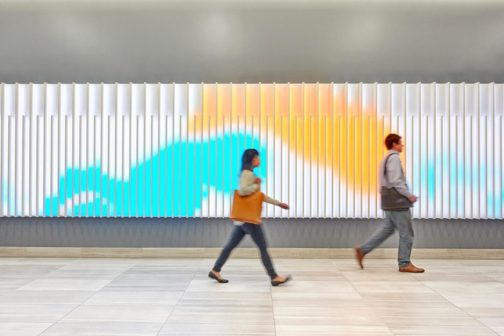
In answering these, we can build on past work and experiments. ESI Design has been producing permanent designs with zero-touch reactivity for years, all with the intention of allowing visitors to impact the space around them as one way to remind visitors that they matter. Depending on the context and user needs, we sometimes do this on an individual scale, with subtle approaches such as our design at 44 Montgomery Street in San Francisco. In this building, the lobby itself becomes the canvas, and the people who pass through it, the paintbrushes. When two people cross paths, the colors mix and swirl around each other, creating new colors and unexpected patterns.

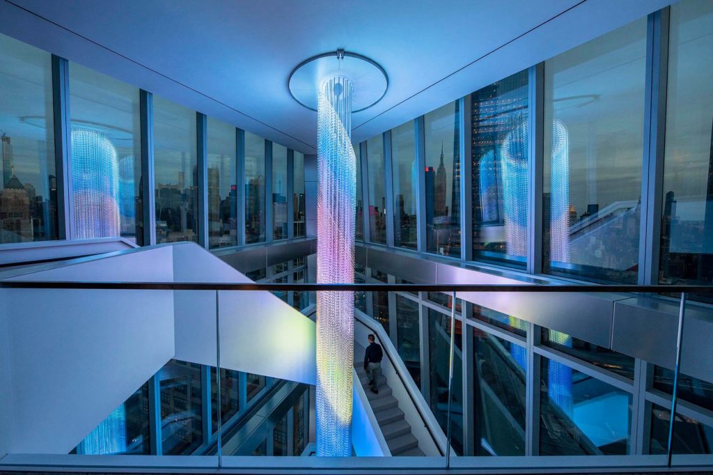
Working with WarnerMedia for their HQ in Hudson Yards, we created a 65’ video, sound and light sculpture. Named the Prow, this sculpture takes content created by artists from WarnerMedia’s many properties, and in real time lets employees control how the visuals are abstracted, then showcases their work in a new form that is part of the New York city skyline.
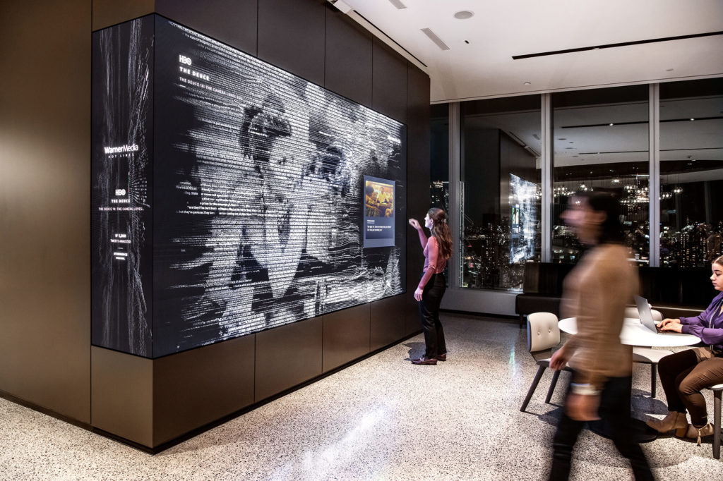
Other installations at WarnerMedia, connect visitors to the wider fanbase, scraping social media for the most talked about scenes from their latest releases and tying those conversations to quotable lines from the script. When ESI Design installed this project in 2019, we engineered a combination of LiDAR sensors and depth-sensing cameras, giving users the full functionality of multi-touch screens on a traditional LED surface. The benefit of this technology is that if WarnerMedia wanted to adapt the interactives to be touchless, they could do so using the existing LiDAR and LED technology. Employees and visitors would then be able to control the screens by hovering their fingers about an inch away, while the content reminds each user that they are part of a larger community, showing the ripple effect of one moment impacting conversations across the world.

Over the years we have also experimented a lot with displays and form factors optimized to showcase natural environments. Displaying natural green environments is proven to reduce cortisol levels which, in moments of stress, reduces anxiety, irritability, and makes people more focused. Current research from cognitive scientists suggest that these positive effects are strongest when the dominant colors are in that 520 – 560 nm green color range, supplemented with some visuals or sounds of running water. I have also found that these designs work best when they break free of the 16:9 frame, which is why ESI Design works so hard to bring unique form together with custom content through media architecture.
Continue reading this article on AVIXA.com >>
Interested in creating safe public spaces following COVID-19?
Get in touch with our team.


Join The Conversation