How to Rethink Wayfinding to Increase Infection Control and Decrease Patient Stress
Posted April 13, 2020
ESI Design’s Principal, Design Management, Alexandra Alfaro, co-wrote this with our colleagues at NBBJ Eric Levine and Janet Dugan offering three ways to guide hospital visitors seeking coronavirus care.

As hospitals across the world flex to meet a surge of coronavirus cases, they are rapidly adapting their facilities to accommodate testing, infection control and inpatient care. However, navigating to, around, and in a hospital — particularly under these quickly-evolving circumstances — can be stressful and challenging.
Studies show high levels of the stress hormone, cortisol, can decrease memory and critical thinking skills. Even during normal circumstances, 30 percent of hospital visitors find it difficult to get to the right place because they get lost. Today, some people with coronavirus symptoms, many severely ill or under duress, enter the hospital without alerting staff before they are triaged, potentially exposing others unnecessarily to the illness and requiring staff to then isolate them, triage them and disinfect any spaces that may be contaminated.

1. Deploy a comprehensive wayfinding system for COVID-19.
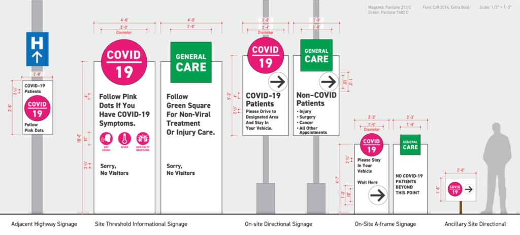
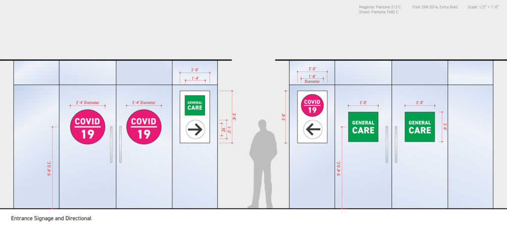
Given this urgency, it’s critical to employ a consistent wayfinding system for COVID-19 to help direct patients to the right place. The good news is hospitals can quickly improve the patient experience now with a comprehensive set of environmental graphics that address a visitor’s spectrum of interactions — from pre-arrival to discharge — with unified elements such as simple shapes, unique colors and a list of COVID-19 symptoms. Here are a few items to consider when creating signage for the crisis.
Graphic design and content recommendations
Keep signage simple to decrease anxiety. Graphic design treatments such as using the color pink, which is unique from typical hospital signage colors, can help important messages pop. Recognizable shapes like circles or squares are both noticeable and simple. Much like retail stores, such as Ikea with its clear, visible and instantly recognizable signage, hospital wayfinding that relies on repetition, standardization and familiar shapes can help people quickly orient themselves and lead them through a space in an intuitive way.
Reduce text to only the essentials so directions are easy to digest. Outline primary symptoms of the coronavirus to help visitors differentiate between other illnesses like the flu. For example: “Follow the pink circles if you have COVID-19 symptoms such as a dry cough, fever and shortness of breath.” Signs for non-COVID medical conditions could include language such as: “Follow the green square for non-viral treatment or care.”
Consistent visuals and content should be carried through all steps of a hospital visitor’s journey, from pre-visit information online to outdoor signage at arrival, to indoor navigation once visitors are through the hospital entrance. It is key for hospitals to utilize a wayfinding system that is easy for patients and healthcare staff to understand and follows a unified theme.
Website notices
To better welcome and inform visitors before they get to the hospital, it’s crucial to incorporate coronavirus-related wayfinding graphics into pre-visit messages. These should use the same colors and shapes as on hospital signage for COVID-19, so there is a consistent look and feel when a visitor arrives on site.
Pre-visit information can include online notices featured on the top of a hospital’s homepage, on social media, or a dedicated landing page that can be regularly updated. For example, using a URL like “www.HospitalName.com/coronavirus” will rank higher in search results when patients query “Hospital Name Coronavirus.”
In addition, be sure to address: Where should people go to get tested? Are directions to the campus straightforward and concise? Provide these details succinctly up front to clarify any confusion. Given the highly-contagious nature of the coronavirus, this can help ensure visitors who may present with COVID-19 understand any special protocols ahead of arriving at the hospital to help keep the public and caregivers safe.

2. Prioritize signage.
It’s important to consider the placement of signage to help guide visitors before and when they step foot into the hospital. Signage allows patients to self-triage prior to entering the hospital. It streamlines the process for emergency departments, reduces patient stress upon arrival and increases the ability to identify infectious patients, making arrival safer for all. It also provides guidance for patients that may not have seen pre-visit information online or forgot the instructions.


Join The Conversation