Six Steps To Creating Emotionally Engaging Data Visualizations in the Workplace
Posted February 24, 2020
Data has revolutionized how we live and work. It has become a powerful driver in forming habits, from keeping track of our health and activity, to monitoring our sleep patterns and smart home technology. Unfortunately, sometimes we are inundated with so much data that we take little notice of it.
In this video, an ESI Design interaction designer discusses the ways you can use data to create experiences that “delight, resonate and create a lasting impression with people” through thoughtfully designed, and emotionally engaging data visualizations in the workplace.
Let The Data Tell The Story
Have you thought about transforming workspaces into experiences by using data visualizations? The techniques of mining data through repositories, reimagining data to tell compelling stories, and creating data visualizations that are digestible allow visitors to engage in the world around them and learn from the experience.
Six Steps To Designing Data For Emotional Experiences in the Workplace
We came up with six key steps to follow to successfully design for emotional experiences rather than analytical experiences:
- Space: What is the history of the environment and the space that you are re-designing? This is the first impression the brand will give the user. What feelings does is evoke in a visitor?
- Story: What is the reason for this space being here? Why should people come to it? What story does the brand need to tell?
- Data: What data is available? How is it organized? Is there anything interesting or unique here that can be teased out? What data can inform on the final experience?
- Experience: What will visitors encounter? What is the data’s purpose? How does the environment engage the visitor?
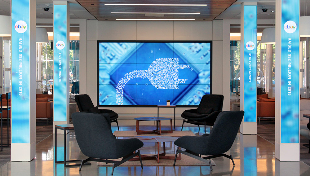
- Interface: How do you effectively communicate the data? Is it through immersive columns and multi-touch walls, as in the case of eBay’s Main Street headquarters or a floating dynamic chandelier found in PNC’s Lobby in Pittsburgh? The form-factor comes really late in the process.
- Testing: Before the big reveal, it is important to do a full-scale mockup to prototype and test your idea. Is your design intuitive? Does it clearly convey the information you have designed? Do people interact with it easily or at all? Does it evoke wonder? And finally, does it accomplish its purpose?
To see these six steps in action, watch the video on how ESI Design created beautiful sculptures, renovated lobbies and set the standard high for data visualizations that tell stories, speak to people and leave lasting impressions.
Looking for a way to create emotionally engaging data visualizations in your workplace?
Get in touch with us to chat with our team of designers.
Join The Conversation