The Power of Light
Posted July 25, 2014
Linnea Tillet’s lighting design reveals how light and shadow work together in design.

Linnea Tillet is the Principal and Founder of Tillet Lighting Design. The firm’s specialty is incorporating lighting design into the environment through the lens of a perceptual, behavioral and psychological awareness of the effects of light. The work of Tillet Lighting Design runs the spectrum of styles and implementations: landscape, infrastructure, public art, interiors and art collections. The reason that I highlight Tillet Design and the work of Linnea Tillet as an example is because the way that they approach each project is a balance between the pragmatic needs of the space and an artistic temperament that strives to reinvent the feeling of the environment.
They put it very well in their design manifesto:
Our work is both poetic and non-poetic (i.e., practical). We oscillate between pragmatic and aesthetic function—tipping even the most straightforward condition—a street, a hallway, a bike bridge—into a condition that is open to artistic form.
We respect the need to protect the night sky and wellbeing of the many nocturnal species inhabiting our world. Hence our approach turns on first analyzing where—and even if—lighting is needed. Whenever possible, we amplify, reuse and refine what exists. And if light is missing, we add it in as subtle and efficacious a manner as possible.
We operate with an acute sensitivity to the desired emotional texture of a space—its affective, social and economic dimensions. In shaping the ambiance of a place, we look to impact not only the visual experience, but, as importantly, the felt experience.
Finally, we recognize that we are operating in a global climate that is increasingly complex, extreme, unpredictable and even savage. Therefore, we look to employ new thinking and techniques so that our lighting installations can function in unstable and adverse circumstances.
In June of this year, Metropolis magazine wrote a review of Tillet’s work, from which this blog post was inspired. In the article Akiko Busch wrote that, “Linnea Tillet is unusually engaged with nuances of darkness, aware that human perceptions is a matter not just of seeing light, but discerning shadow.” The addition of light into a space is often the removal of shadow, or the degradation of the shadow that exists. Similar to the way in which graphic contrast works in the 2D world, the contrast light produces with its contrasting element — darkness — reveals the power that light has in design.
The effects that are created by the play of designed shadow and light are felt psychological and emotionally. We gain a sense of security, or a sense of danger. We feel more informed or less informed, depending upon the way in which light fills or hides within the environment. Romantic evenings are darkened. Schools are brightly lit spaces of information transfer. The examples of how degrees of light effect our daily being continue ad infinitum. This is why Tillet’s principles of design are so interesting. The recognition that light is a driver of physical and spatial conditioning allows her to craft not only visual sights, but emotional responses in the environments in which she intervenes.
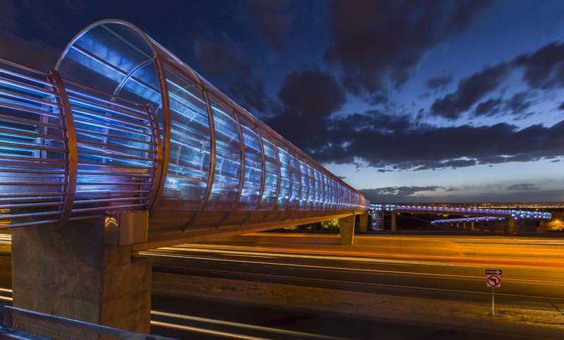
Tillet has used LEDs to transform spaces into places that are infused. What they are infused with depends upon the psychological reactions of the visitors. In Albuquerque, Tillet’s firm took on a project that might not seem like such a good fit for an artistic leaning designer. The Bear Canyon Bicycle and Pedestrian Bridge stretches over I-25 in north central Albuquerque. In the flat landscape of the city, it was another concrete stretch. It connected two pathways along the Bear Arroyo Trail, which snakes through the city.

Tillet Lighting Design enhanced — if that adjective does the necessary justice to the installation — the walkway with a cool blue LED installation that does not invade the space, but provides it with an elemental presence. It is easy to imagine that at night the walkway was a dark imposing place. It didn’t have a real lighting source of its own, but relied upon the ambient light from the rest of the city. Lights from the passing traffic passed beneath it, causing an insecure impression. The light blue glow that Tillet Design chose places the walkway in its environment. The soft tones reveal the physical space, but not with an uncomfortable glare of white. From afar, the project is a beacon, a trail that winds up and over a major highway, but grants the surrounding landscape the essence of a gallery. The environment holds the work.
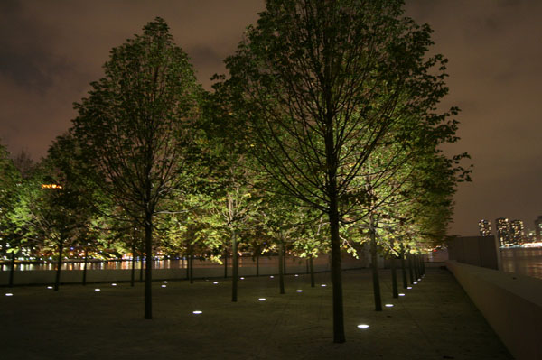
Other examples of her work share the same ethos and delicate entry into the environment. The Franklin D. Roosevelt Four Freedoms Park in New York is an illuminated grove of trees. From above the lights form shapes that point forward — into the future? — a mark of progress on Roosevelt Island for the once Governor and President.

All of her projects should be viewed on her website and the Metropolis article is great entry into her working process. The key take away, for us and we hope for you, is that the psychological approach to lighting design — and all design — allows designers to create experiences in provocative ways heretofore unimagined. Emotional connection is important because emotions are important. We seek place and placement, organization when there is none. We want light when there is dark, and dark when there is light. Design, and that of Linnea Tillet, brings us the balance of these opposing forces.


Join The Conversation