ESI Design Completes Historic Building Renovation of Portland’s Power + Light Building
Posted October 2, 2019
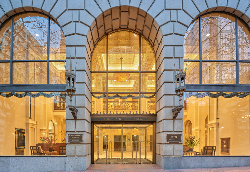
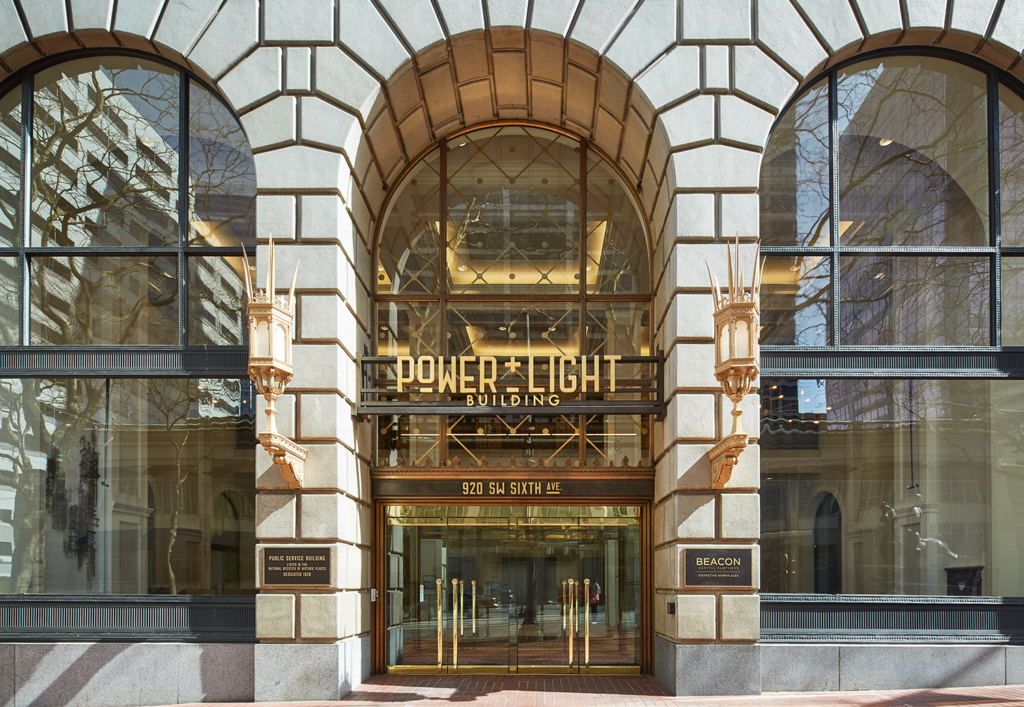
Once the tallest structure in the city, Portland’s Public Service Building was struggling to reflect the energy within its walls 90 years after it was constructed in the 1920s. Though it continued to house Portland’s main power station, its outdated interior no longer captured the vibrance needed to attract tenants to the many office spaces within. Beacon Capital Partners tasked ESI Design with finding a way to make the building’s powerhouse past the key to its future as a contemporary destination in a historic building renovation and rebranding project. During the design process, the ESI Design team decided to rename the structure as the Power + Light Building to celebrate its identity as a symbol of energy, warmth and power.
Creating a New Identity
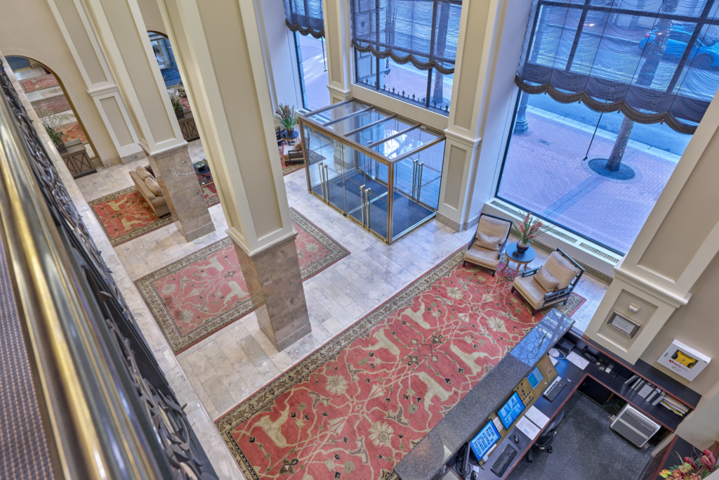
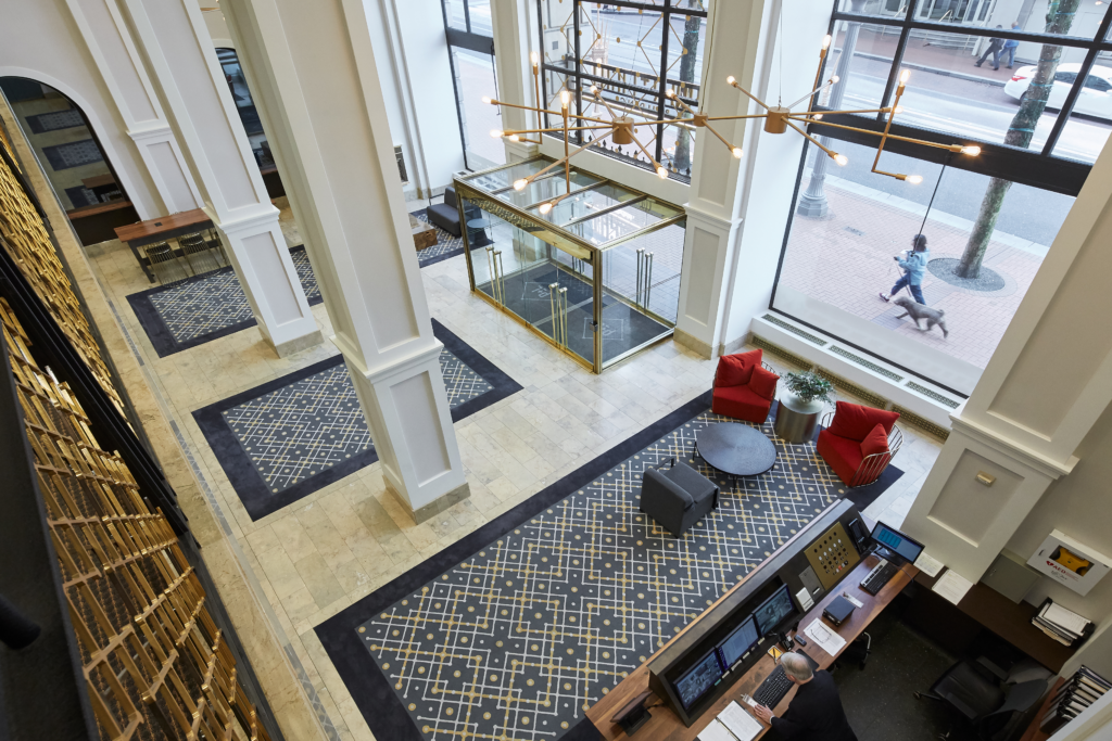
Pops of color were added to the formerly monochromatic lobby in conjunction with purposeful patterns on the carpets, lighting and mezzanine railings. Inspired by the look of a connected electrical circuit, the pattern pays homage to the historic building’s role in connecting all of Portland’s residents to power and light. A plus and minus motif is also present throughout the building — in the new logo, a plus sign unites power and light. These symbols carry the association of an electrical charge, reinforcing the building’s identity as an energetic hub for innovation. Also visible in the clock above the elevators, as well as the carpeting and mezzanine railing, the plus and minus signs are subtle yet strong contributor’s to the lobby’s new cohesive, contemporary aesthetic.
The repetition of electricity-inspired graphics seamlessly weave the building’s modern look and feel with its monumental past to enhance the tenant experience. As a leader in experiential design, ESI Design created a new identity for the historical building by allowing reminders of the past — the building’s role as Portland’s electrical supply — to serve as defining features of the present in electrical-themed branding. This is also evident in the custom font used for the building’s signage and logo above the main entrance, which was derived from details included in the structure’s original detailing.
Modernizing the Lobby
Complimentary colors tie the lobby walls to the updated furniture. The reception desk was upgraded to accommodate modern security and computer technologies and a luminous bronze finish to blend better with the gold accents throughout the space. An eight-seater table was also added. Its industrial base and natural wood finish serves as an eye-catching hot-desk collaboration area for tenants and visitors alike.
As implied by the building’s name, lighting plays a crucial role in creating an elegant workplace destination for a variety of tenants. The historic building renovation included the removal of outdated pendants, which were replaced with new bronze fixtures and additional cove lighting. Paired with warm, naturally finished furniture, the new lighting fosters an inviting and charming atmosphere that embodies the essence of Power + Light.


Join The Conversation