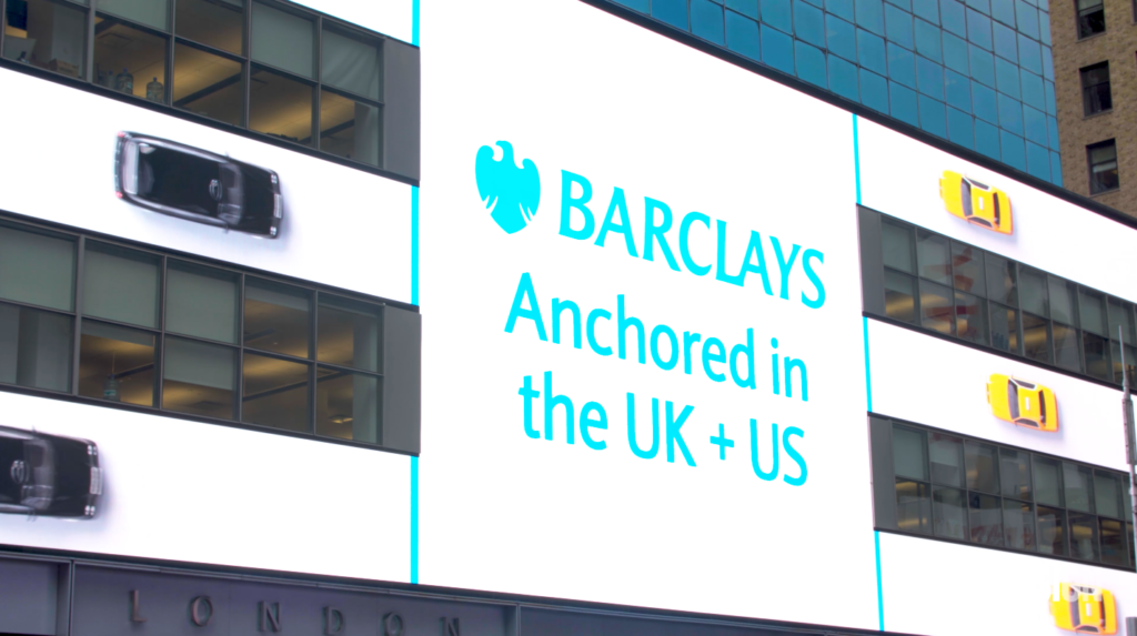
Barclays Times Square Sign: Trans-Atlantic Traffic Jam Picks Up Award for Creativity
Posted February 4, 2020
Amidst the giant, glowing billboards of Times Square, 7,046-square feet of new LED signage has made a huge impact—and not only because of its size. The new digital signage installation at the Barclays NYC headquarters stands out from its Times Square counterparts. Coming to life with a mixture of data visualizations, dynamic animations, and human-centered storytelling, this award-winning and architecturally integrated installation isn’t just another glitzy billboard for advertising—rather it’s a state-of-the-art branded storytelling platform. A mixture of sophisticated storytelling and innovative technology propelled Barclays Times Square sign at 745 Seventh Avenue to pick up a silver award for an out-of-home B2B campaign at the 2019 Financial Communications Society Portfolio Awards.

Anchored in the UK, and the US
Barclays is a trans-Atlantic bank with global reach anchored in the UK and the US. In thinking about what uniquely connects these two cities we considered the iconic black taxi cabs of London and the yellow cabs of New York. The end result is a playful animation on a giant scale. Yellow cabs and black cabs “drive” into view from opposite sides of the sign, meeting together in the middle, before turning and “driving” off the sign. We also threw in a few red London buses, too—just for fun! This unique, even whimsical, media piece helps communicate Barclay’s presence and commitment to both the UK and the US, and creatively introduces Barclays to the New York audience.
See the award-winning creative here:
Complex Markets, Understandable Stories
Since this installation is visible to the 130 million yearly visitors who pass through Times Square, the stories needed to speak to the general public just as articulately as they do to Barclays employees, customers, and partners.
Between ESI Design’s creative experience design capabilities, Barclays’ wealth of exciting financial stories, and the amazing technology enabled by our partners, it’s no wonder the whimsy of a London double-decker bus in Times Square garnered some attention.


Join The Conversation